Category: Criticism
-
What Comes After Form?
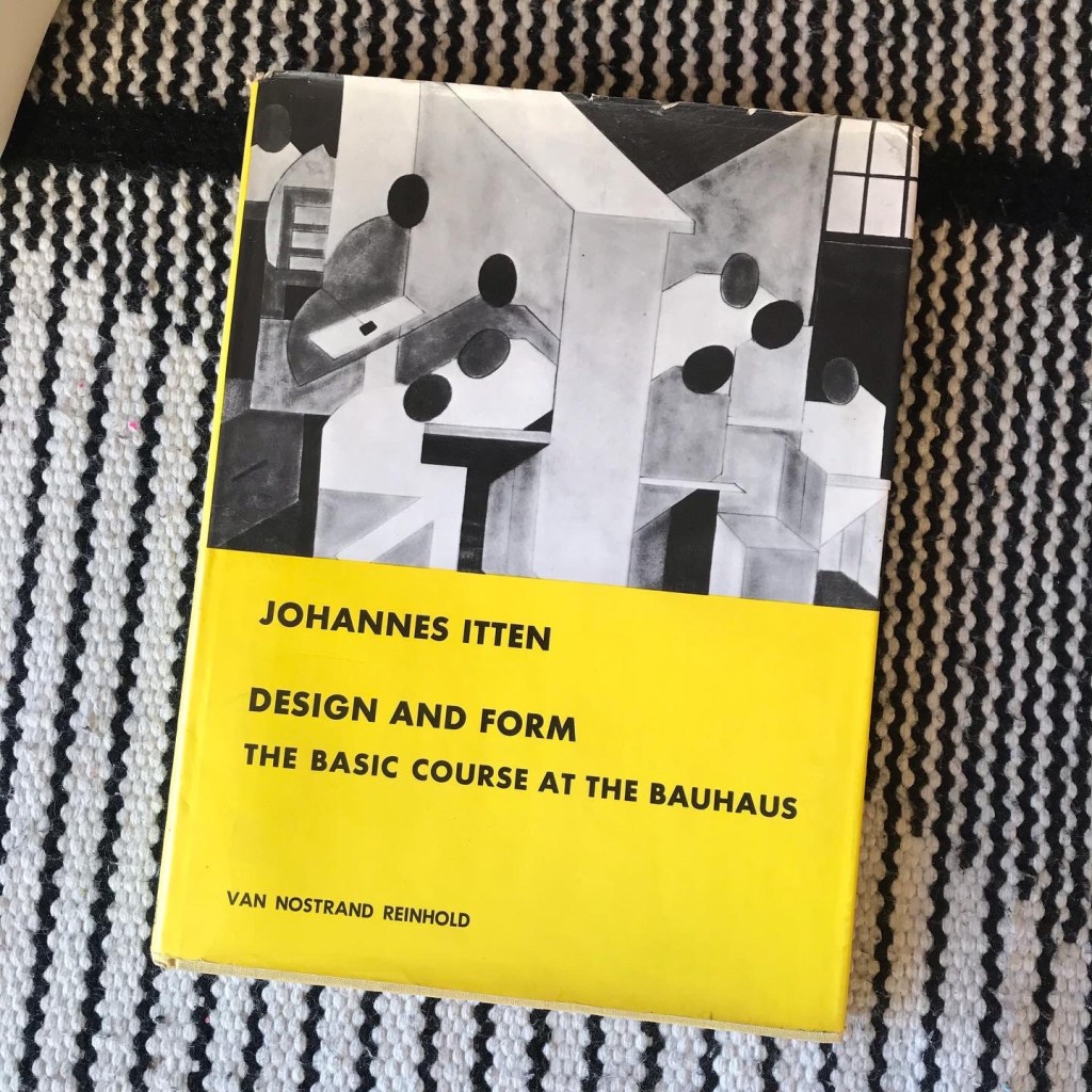
There was a time when every other design book or magazine had to mention «form» on its title. When did speaking about form in graphic design begin to feel so dated? It’s not that form has vanished, but designers no longer consider it an overarching problem. It’s taught at school using old Bauhaus or Swiss…
-
Form is political
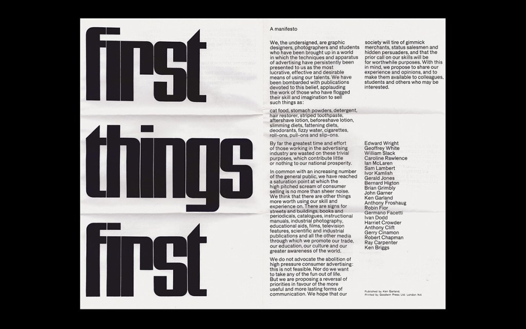
What are we speaking about when we speak about the politics of design? The “First Things First Manifesto,” published originally in 1964 and updated periodically, is an excellent place to search for an answer. In brief, the manifesto appeals to designers to do less publicity work for corporate clients, choosing instead to solve public and…
-
Louise Brooks, 1986

If not for the year printed on the lower right corner, you could date this small collection of Louise Brooks’ essays designed by Luís Miguel Castro just by the generous letterspacing. In the first half of the 1980s, it was fashionable to space every typographic element forming grids. The blown-out halftone pattern underlines this formal…
-
Design’s Lock
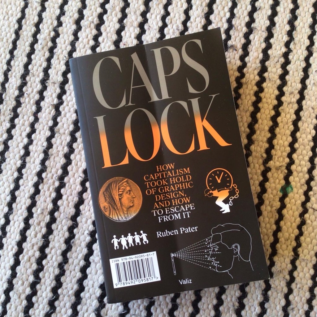
I enjoyed Ruben Pater’s Politics of Design. Pater has a knack for engagingly weaving ideas from a vast array of sources. Now I’m reading Caps Lock, his big book on Design and capitalism. It will be a welcome addition to the bibliography of my design criticism course. There is, however, a detail that tickles one…
-
Modern Swiss Architecture – Max Bill
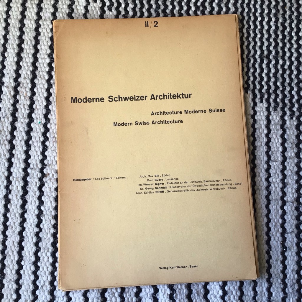
Perhaps the most salient feature of being a teacher, researcher, and curator in graphic design history is dealing with images from Philip Meggs, «A History of Graphic Design» – the closest equivalent to a material embodiment of the discipline’s canon. Over the years, I found myself looking for the artifacts that appeared on those pages,…
-
Positive Space
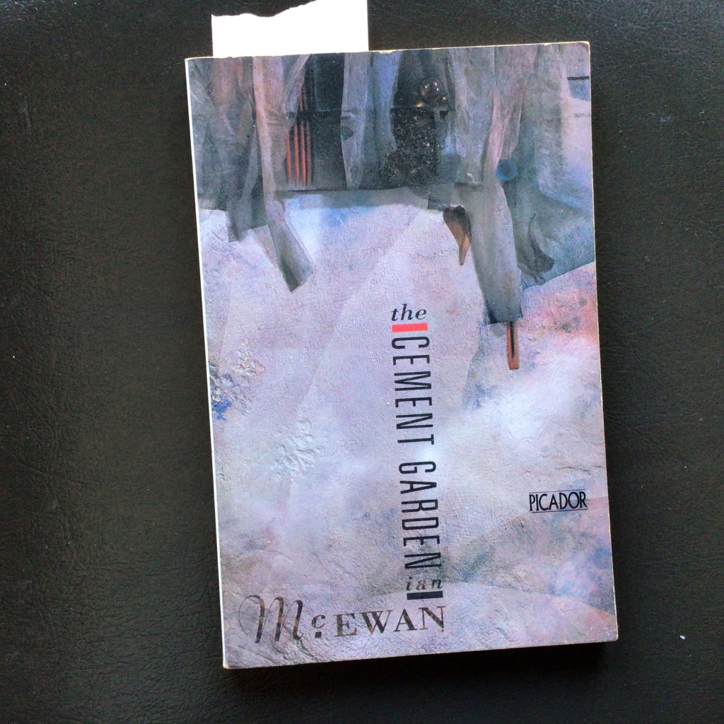
This is one of my favorite 80s book covers. Designed by the incomparable Vaughan Oliver and illustrated by Russell Mills. Both are best known for their work on record jackets, especially for 4AD. I love Oliver’s typography, combining very different fonts in a tight geometric composition eased by the swash of the ‘m’ and the…
-
Graphic Design Tropes: Water on Flat Image

I love Oliver Munday’s cover for The Water Statues. It risks a literal interpretation of the title but pulls it off with an understated suggestion of tears. The use of drops of water over a flat surface, a drawing, or a photo of a statue hints at layers of distance and emotional unavailability. The subdued…
-
The Designer as Form, the Designer as Fiction

Twenty-one years ago, Ernst Bettler appeared for the first time on the pages of the second issue of Dot Dot Dot magazine. He was a fictional swiss designer character, concocted by Christopher Wilson from a collage of bits and parts nicked from graphic design’s canon – the Container Corporation of America, the Futurists, Muller-Brockmann, Vivarelli,…
-
Paul Rand, the Culture Wars and Feminism
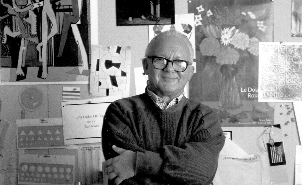
Today, I read another raving article about Paul Rand. I like his designs, but I cannot enjoy the hagiographical little stories that people tell about him. His text, Good Design is Goodwill, is still passed around by teachers to students without much commentary as if Rand had written it yesterday. In this essay, Rand explains what it takes…
-
The Absence of Objects in Design Criticism

In the past two decades, there has been an ever-widening effort to develop forms of graphic design criticism. There are new programs, new writers, new curators, and unusual vehicles and formats. To someone like me, who studied graphic design before that, it is an unbelievable profusion. A sign of that abundance is that most of…
