
If not for the year printed on the lower right corner, you could date this small collection of Louise Brooks’ essays designed by Luís Miguel Castro just by the generous letterspacing.
In the first half of the 1980s, it was fashionable to space every typographic element forming grids. The blown-out halftone pattern underlines this formal strategy.
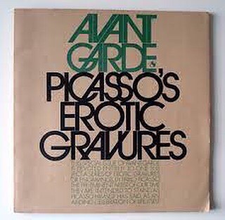
The trend was in part a reaction to the tight-fitting typography of the late 1960s, characteristic of designers like Herb Lubalin, and made possible by photocomposition. Lubalin’s Avantgarde typeface was the peak of this movement. The leaning, interlocking forms echoed the ambitions of erotic liberation of that time.
By the end of the 1970s, the trend had run its course. Affecting social alienation and physical distancing became the new cool.
(The second image is not mine)

Leave a comment