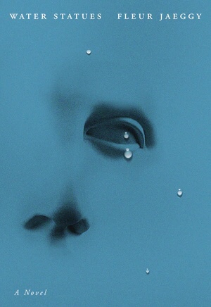
I love Oliver Munday’s cover for The Water Statues. It risks a literal interpretation of the title but pulls it off with an understated suggestion of tears. The use of drops of water over a flat surface, a drawing, or a photo of a statue hints at layers of distance and emotional unavailability. The subdued typography, the same size for title and author, generously letterspaced, echoes the dispersed white of the drops, emphasizing the two layers concept.
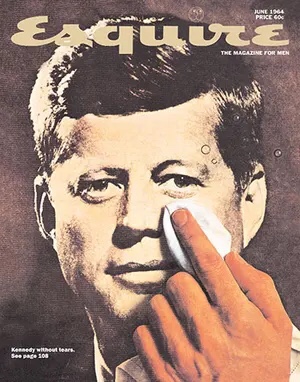
The same general trope, water droplets on a flat image, is not new. George Lois used it to significant effect in an Esquire cover memorializing JFK. Here the tone is mournful. It doesn’t convey emotional distance, quite the opposite. What is unrecoverable here is a different, more innocent political age.
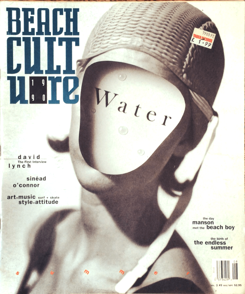
Geoff Kern uses the same ingredients to build a surreal assemblage for the cover of Beach Culture Magazine. Here the droplets are on a receded surface created by a cut-out. The apparent redundancy of presenting water as an image and text adds to the layers of interpretation.
Funny how collages began by being avant-garde but nowadays are mostly nostalgic.

Leave a comment