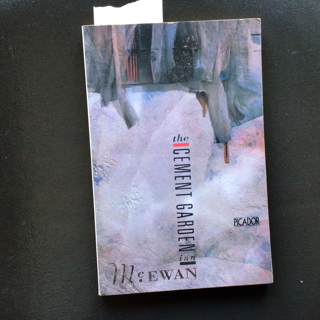
This is one of my favorite 80s book covers. Designed by the incomparable Vaughan Oliver and illustrated by Russell Mills. Both are best known for their work on record jackets, especially for 4AD.
I love Oliver’s typography, combining very different fonts in a tight geometric composition eased by the swash of the ‘m’ and the photographic texture on the author’s name, which fuses it on the rich background of Mill’s assemblage.
One of Oliver’s best features was how he staged typography as objects inside lush compositions. It was all made with practical effects, papercut, plastic letters, placed on rich, evocative backgrounds.
It isn’t easy for me to judge the impact of a designer without trying to understand what influenced him and what he rejected. In Oliver’s case, the moody,
the ambiance and poetic materiality were set against the day-glow cartoon graphics of New Wave or seventies Push Pin Pop.
The unity of the design is achieved not through the use of negative white space but by turning this space into a literal material space that is alive with color, texture, pulsating with wondrous feelings.

Leave a comment