Category: Criticism
-
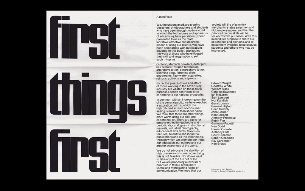
‘Trendy’ – a critical anatomy of the role of trends in graphic design

With some variations, it always goes like this: A designer notices a trend. Many of their colleagues use the same font, or align text a certain way, or employ similar illustrations or images. They get angry. The next step is to declare it a ‘trend’. They complain that nobody thinks about design anymore, “it’s all…
-
Why the aversion to self-reflexive design?

W.J.T. Mitchell developed the idea of Metapictures in the book “Picture Theory” (1994). These are images about images. They can be cartoons about cartoons, photographs about photography, cartoons about photography, and so on. They can even theorize about images – hence “Picture Theory.” Magritte’s painting “The Treachery of Images,” commonly known as “This is not…
-
The roles of neglecting images, form and style in graphic design’s political discourse
It is not that designers avoid images. The issue is that they don’t speak about them — particularly when compared to the attention to detail devoted to typography. Conversations about form or style are infrequent and often vague, primarily consisting of labeling as “trendy” work and designers you disapprove of. This widespread avoidance of discussing…
-
Defining social, moral and political Borders: the Text/Image divide in Graphic Design

One of the crucial social functions of graphic design is enforcing the boundaries between text and image. These limits form a profound political, social, moral, and religious frontier. Within the field of graphic design, the demarcation lines separating text and image are crucial in defining what falls within the discipline of graphic design and what…
-
Exploring Design’s Shift Away from Image
In my last piece, I argued that design shifted its focus away from images at a time when these are all-pervasive. It is plausible to suggest that graphic designers embraced a greater specialization in typography to avoid obsolescence. If everybody is now an image-maker, we could care for the “rest.” While we may perceive our…
-
Design and image?
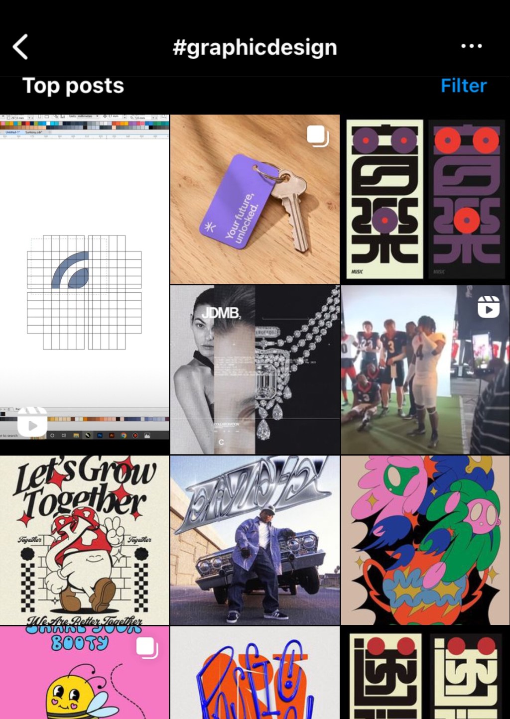
How can you tell if an Instagram account belongs to a graphic designer? While most people use the platform to display photos, graphic designers show letters: fonts, logos, posters, magazines, books, or websites. Even more fascinating is their use of a social network made for showcasing for photos to share little textual slideshows. This tendency…
-
Forget design?
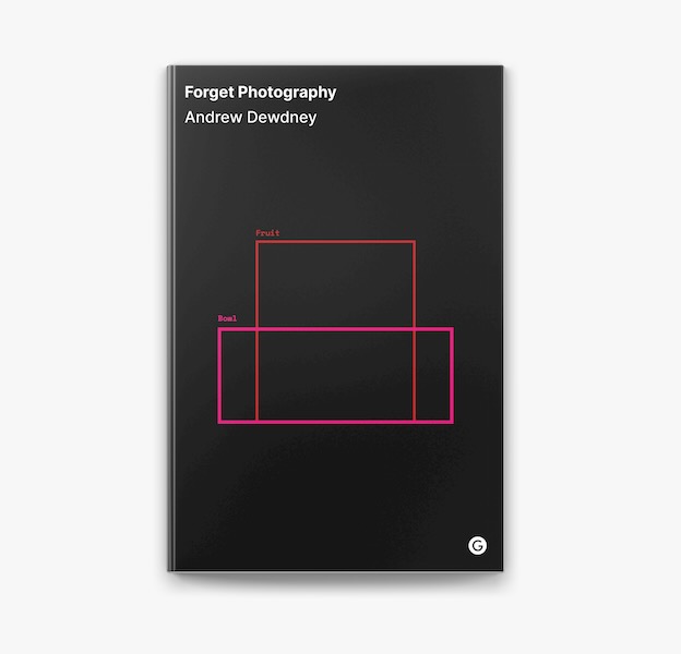
«Forget Photography» has a clever cover for a book that is a great read.1 Andrew Dewdney believes that the paradigm of photography can no longer explain what he calls the networked image. Photography can’t account for its central role in constructing capitalism, white supremacy, and patriarchy. Dewdney proposes, in short, to forget photography. He does…
-
The missing centennial.
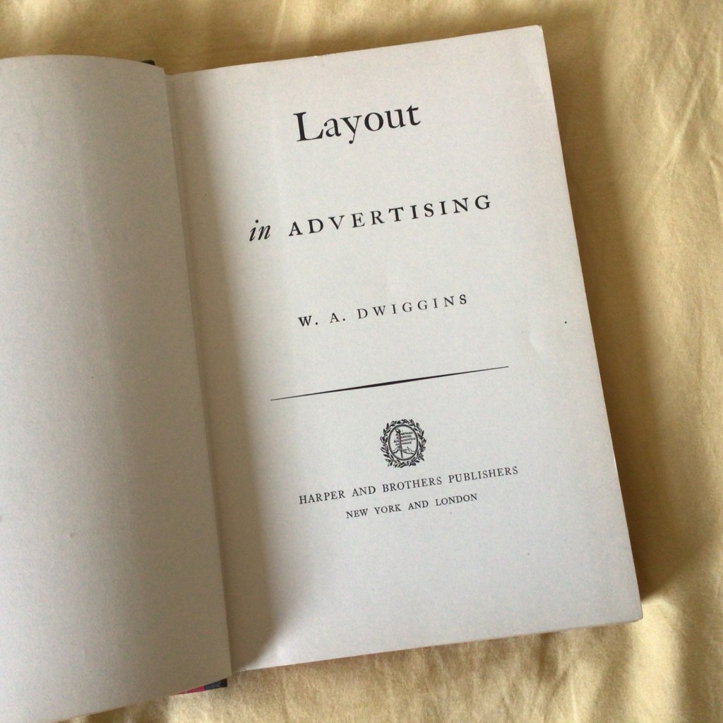
W.A. Dwiggins first used the term graphic design in the text “New Kind of Printing Calls for New Design,” published in August 1922 in a special section of the Boston Evening Transcript devoted to the graphic arts. It was a hundred years ago this August. I waited in vain for the fireworks. As a discipline,…
-
What about Ukraine?
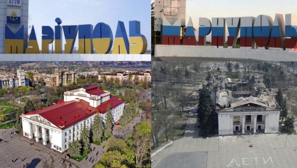
It has been challenging for me to think about the implications of Ukraine’s war on graphic design. I haven’t read any texts or interventions on the subject. Before writing this post, I took a look at Aiga Eye on Design and Design Observer and found nothing. The same at Futuress. I don’t know if I…
-
What Comes After Form? (2)

If Form is not Design’s paradigm anymore, what comes next? If you’d asked art critic Hal Foster around the turn of the Millenium, he would probably answer Design itself succeeded Form. In 2000, Foster published his influential essay “Design and Crime,” which echoed Adolf Loos’ “Ornament and Crime.” Loos’ text was a violent, often racist…
