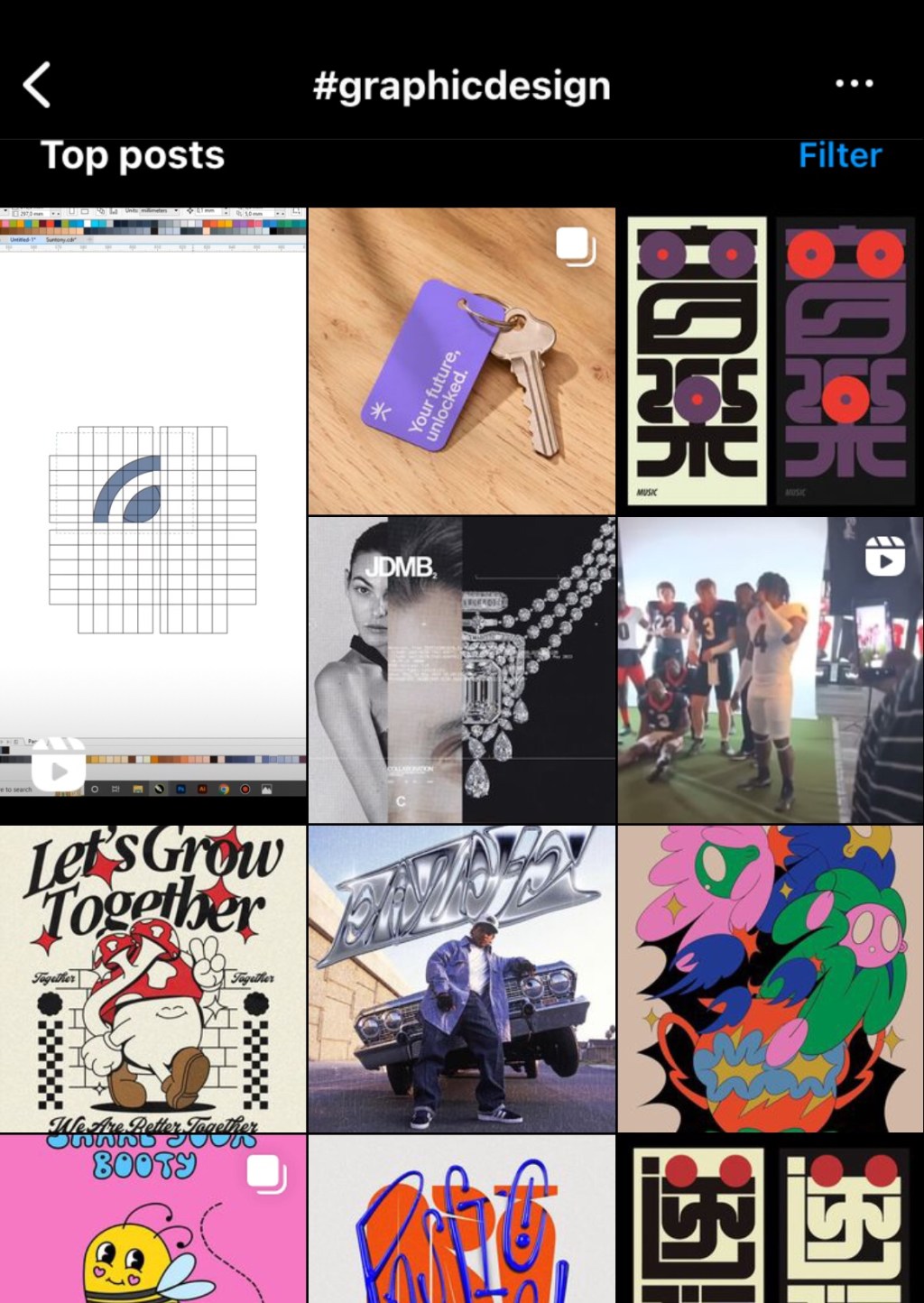
How can you tell if an Instagram account belongs to a graphic designer? While most people use the platform to display photos, graphic designers show letters: fonts, logos, posters, magazines, books, or websites. Even more fascinating is their use of a social network made for showcasing for photos to share little textual slideshows.
This tendency upsets the conventional notion that graphic design is a visual area. Is it about images in general or just about the visuality of text?
During the 20th century, graphic design was as interested in images as in type. Laszlo Moholy-Nagy envisioned a future where words and pictures would merge, as seen in his concept of Typophoto. A magazine about typography could be called “Alphabet and Image.” Robert Massin’s “La Lettre et l’image”. Philip Meggs’ “Type and Image”. Even if the name of Herbert Spencer’s Typographica implied a focus on letters, that publication strongly emphasized the photographic image. David Carson’s Raygun, likewise, was as much about photography and illustration as about type.
It was a troubled relationship (as we shall see in other texts), but image was not an afterthought, a rectangle sitting next to the typography.
As this century began, graphic design experienced a discernible shift toward typography and text. There was a revival of classic typography, type, and book design after the 1990s, a decade of experiments that fused text and image in tantalizing compositions. Modernism made a comeback but without its core obsession with uniting image and type.
Why did this happen?


Leave a comment