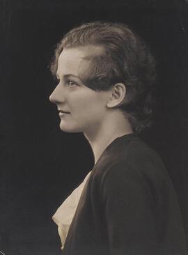
In her most famous text, Beatrice Warde (1900 – 1969) wrote that typography should be like a crystal goblet: in order to enjoy the wine, the glass must be neutral and transparent.
Warde published The Crystal Goblet in 1930. It is perhaps the most influential text written by a woman within the field of graphic design.
Warde talked about lettering on the page but proposed an implicit moral code. The designer should be like a crystal chalice – also neutral and transparent.
She published the essay under the name of one man, Paul Beaujon. Neutrality and transparency remain, by default, male, white, cis, and straight.

Leave a comment