
Alda Rosa was one of the great typographic designers of the heroic era of Portuguese design. Perhaps Sebastião Rodrigues is her only peer. By this, I mean that they made a design where typography was part of the whole—no more, no less than that.
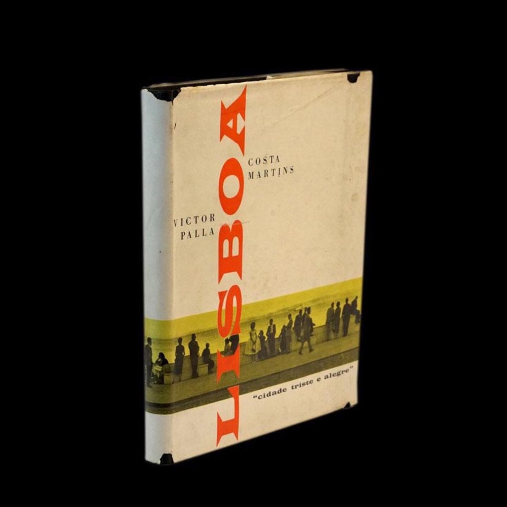
In other practitioners, like Vitor Palla, there was a strong sense of design, but the typography faltered at crucial moments. The cover of Lisboa Cidade Triste e Alegre (1959) is an example, with that vertical “Lisbon.” Palla used Wide Latin so much you can identify his work by its presence. Here it is out of tone. Its decorative and spiky contour plays poorly with the sparse, orthogonal arrangement of the rest.
Rosa uses typography with fluidity and a sense of tone. Her masterpiece is the cover of Herberto Helder’s “Poesia Toda” (1973.) Illustrating the title, she constructs an open capsule. The stars and the woman’s profile fall apart in a movement prolonged by the numeral two and the dot of i.
Rosa’s great mastery lies in seeing typography as both stroke and form. A common mistake is seeing it only as a hierarchy enclosed within its minutiae. The optical alignment that matters most is not between the letters but between the characters and everything else. There is no use in kerning perfection if the relationship between text and image doesn’t work. On this cover, the hierarchy extends from the stroke, thickness, and form of the illustrations to the fonts. It’s more than a typographic hierarchy. It is Design.

Leave a comment