I’ve just finished watching Simon Schama’s excellent series The Romantics and Us.
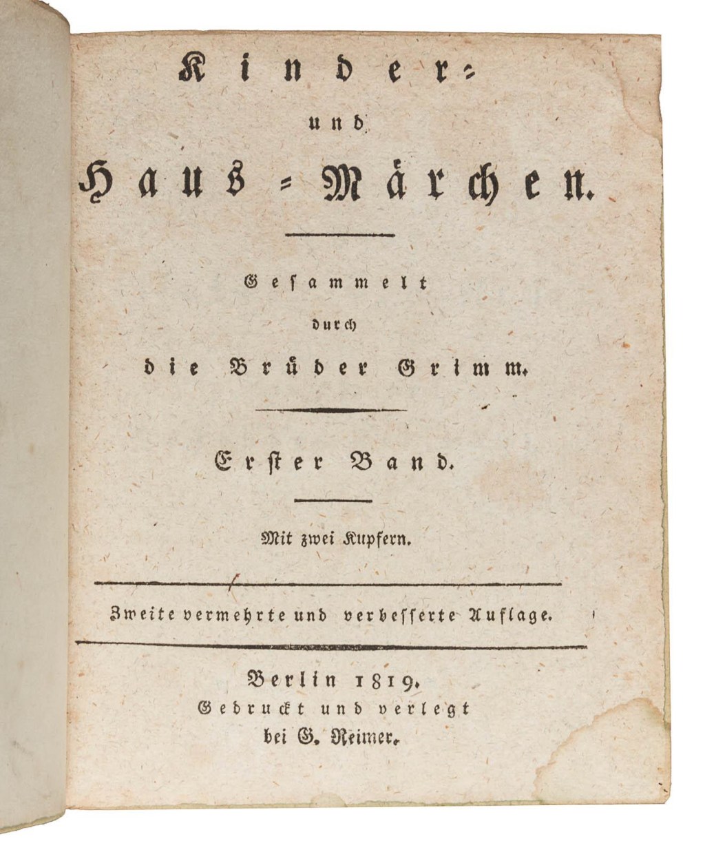
I’m not a typographically obsessed designer, but I couldn’t help noticing an amusing detail: the title page of the first edition of Grimm’s Fairy Tales is almost entirely composed of letterspaced lowercase blackletter.
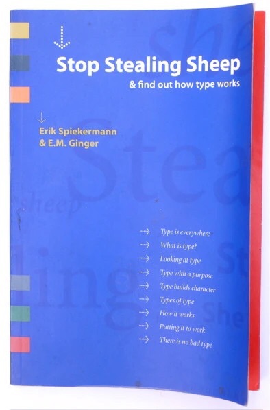
Frederic Goudy famously stated that anybody who letterspaced lowercase blackletter was capable of stealing sheep or worse crimes.
However, in the german blackletter tradition, it was common to space lowercase. In the absence of italics or bold, it was a way to emphasize parts of a text. It was called “sperrsatz.”
It is possible to find this convention in certain Bauhaus books such as Moholy-Nagy’s Malerei, Fotographie, Film.

In the 1990s, Erik Spiekermann updated Goudy’s rule, extending it to all lowercase letters and not just blackletter. The practice is still enforced in typography classes.
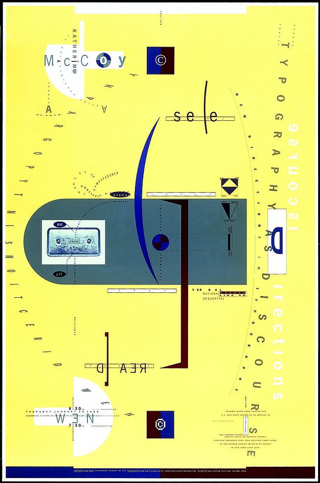
However, Spiekermann was probably reacting to the 1980s trend of generous letterspacing that was a reaction to 1970 tight spacing – as in the difference between Allen Hori’s loose spacing and Herb Lubalin’s tight, almost erotic, fittings.


Leave a comment