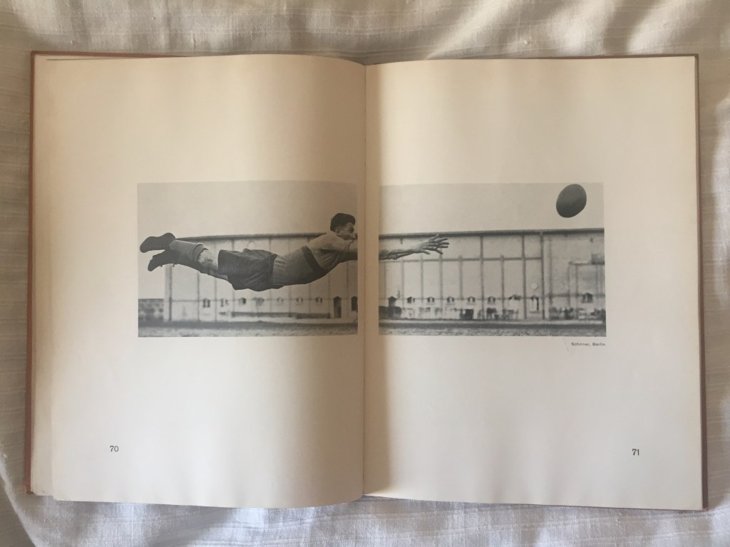
This is my favorite spread from Es kommt der neue Fotograf! (Here comes the new photographer!), Werner Graff’s inventory of modernist photographic composition. The spread is a masterful example of using the book’s architecture — in this case, the gutter — to build the meaning of an image.
It’s a prime example of non-typographic design, the sort of expertise mostly absent from graphic design. There are tons of books about planning publications in typographic terms, but design based primarily on images is mainly left to instinct and taste built through personal experience.
The brilliance of this gutter design is evident because it relies on emphasizing something that usually is artfully hidden — the book as an object full of gaps and jumps. A traditional book is a linear narrative, a long strip of paper one line wide, and cut it so cunningly that the reader never notices that a line ends at the margin or a page has been turned. That’s why so much attention is given to hyphenation, widows, and orphans.
To look for the same care about treating images in a publication, you must listen to a professional editorial photographer like Annie Leibovitz. She thinks of the final tridimensional of the magazine or book when taking a photo.
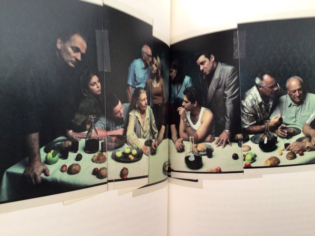
Her famous group photos for Vanity Fair magazine combine images taken from different angles with different cameras. She uses the gutter or the crease between the cover and the fold-out to disguise the lens distortion. Leibovitz knows that, in a publication, you never see all at once but only facets of the whole.

Leave a comment