A Brief Formalist History of Formalism in Design
I started my studies in design by the time the first private TV channels began broadcasting in Portugal. Because of this, I got an overdose of designers bad-mouthing the logo of the new SIC TV channel, created in 1992 by Brazilian designer Hans Donner. If you happened to study design, like I did, you were surely told that a flat coloured logo works much better than a gradient packed bundle. SIC’s logo was the archetype of everything a logo should not be: a 3D shape crammed with millions of colours organised in a commotion of gradients.

A counterexample is Paul Rand’s logo for UPS (fig. 2). Flat and two-dimensional, its linear and geometric construction includes the simplified representation of a package — in reality, it could be used to represent how most designers see themselves: a grid humanised by a little bow.

In 2003, thousands of these designers cried foul when UPS changed its logo (fig. 3) The horror of it. Ten years later, a new gradient-free
version was made — SIC’s has also been updated but kept its million colours and 3D look (fig.1).
Numerous arguments were used to criticise these three-dimensional gradients: they were bad because they were hard to reproduce in different media; they were unnecessarily complicated and perceptually more demanding; they were inelegant; they gave in to fads.
Here, I will essay another explanation. I will not focus on the UPS or SIC logos, but rather on design’s obsession with two-dimensionality and its subsequent mistrust of gradients. I am aware that this is an ambitious task.
I will favour formalist methodologies, because I will be trying to shape a cultural history of form and formal strategies. That is, I will attempt to draw up a history of the specific arguments and theories invoked to justify the use of a given form, rather than a history of the technical, personal or institutional contingencies that have dictated the evolution of said form.
By the end of the text it will be clear, or so I hope, that the outline of this brief history of design’s obsession with two-dimensionality not only brings out the validity of applying formalist methodologies imported from History of Art to the field of design, but will also demonstrate the overlapping origins of design and Formalism (in History of Art). I am aware that this is a surprising thesis, because Formalism has an awfully bad reputation within the field of design, both as practice and theory. To classify an object or designer as formalist is practically an insult. In other texts,1 I undertook a rehabilitation of Formalism. I suggest that it may be a particularly effective critical methodology in the dismantling of Modernist universalism, which continues to play a central role in structuring the identity of design.
Most efforts that have been developed in this field, and align with the critique of this universalism, have focused on contents, topics and context, leaving the core of formal decisions untouched. There is an abundance of very sophisticated critical analyses of the politics of design in what concerns clients, contents, and context. However, the specific nature of the decision‑making processes that concern formal decisions remain largely unexplored — especially in what concerns the politics of form.
Once one accepts that formal decisions are not universal, the realisation has obvious practical implications. To decolonise design, for example, it is not enough to change clients, topics, or context. One needs to decolonise all formal thinking, and this process is already underway. In design, the grid assumes an identity role, based on orthogonality as a universal system of composition. Notwithstanding, according to the research by designer Simba Ncube, there are other possibilities:
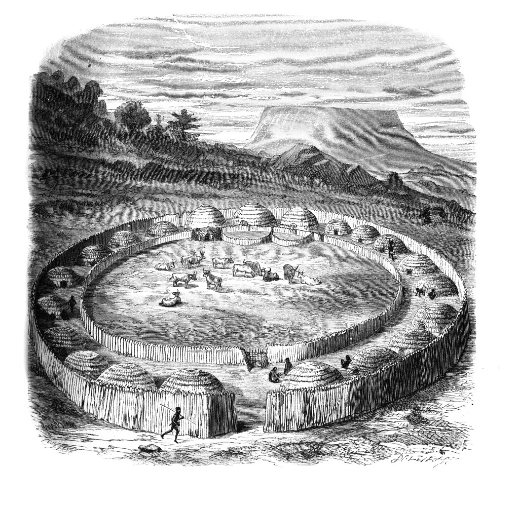
Zulus live in what has been described as a “circular culture.” Their huts are round, they don’t plough land in straight furrows but in curves instead, and their villages are designed in circular formations. [Fig. 4.] In finding such successful solutions for the organization of private and communal space, Zulu architecture should be understood as design innovation. Realizing that the standards we’ve been taught are not universal is key to decoloniality.2
Even if Ncube recovers a non-European projectual mode, he equates it with a form of design. Now, we have no guarantee that design is universal. To assume that the composition methods of another culture are within the scope of design is to ignore the possibility that they may be framed by completely different projectual systems. Buildings, just like books or clothing, do not need to be created using design (i.e. using projectual techniques), but can be built using religious rituals, bureaucratic or military procedures, among many other possibilities.
It should also be noted that, when design was born in the 19th century it was explicitly used to process symbols from other cultures, appropriating them for the industrial production of ornaments. I have addressed the imperialistic origins of design in other works.3 Here, I just want to highlight that this process of appropriation is grounded on a systematic formal analysis. A religious symbol, for example, was decomposed in its elementary forms and rebuilt as a modular ornament, which could be used in a variety of contexts.
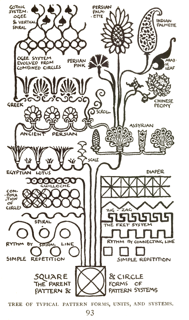
Taxonomies of different symbols were organised according their formal characteristics, their geographic, chronologic, or ethnic origins. This process is very clearly detailed in works such as Owen Jones’s The Grammar of Ornament (1856), in which ornaments appropriated from many cultures are presented as a grammar (fig. 5), or Walter Crane’s Line and Form (1900), where they are presented as a genealogical diagram (fig. 6).
This kind of analysis has clear affinities with formalist criticism and history of art. One can even recognise the formalist ambition to produce a non-hierarchical analysis of the artistic productions of all cultures, relating them using formal strategies.4
The similarities between the formalist approach to the arts and the logic of premodern design are not accidental. For the most part, the two currents coincide in time. Owen Jones publishes The Grammar of Ornament in 1856, Walter Crane presents his Bases of Design in 1898 and Line and Form in 1900. In the fields of History of Art and art criticism, Wölfflin, one of the most influential formalists, publishes his most important works between 1888 and 1915; and Alois Riegl between 1891 and 1902.
However, the similarities between these fields are not a mere expression of a particular zeitgeist from the turn of the century. Design theory and formalist History of Art had several points in common because, in certain fundamental aspects, they were one and the same. Alois Riegl, one of the key founders of Formalism in History of Art, first presented his formalist theories framed in a history of ornamentation, Stilfragen: Grundlegungen zu einer Geschichte der Ornamentik (1893). At the time, he was curator of the Museum of Art and Industry in Wien, a position he held for ten years. Formalism in the arts started as a project in the field of History of Art that aimed to absorb the decorative arts in a non‑hierarchical system. This project resonates with William Morris’s contemporary appreciation for the minor arts, of which the books published by Walter Crane, his friend and collaborator, are an offshoot.
Formalism’s roots in the critical investigation of ornament can be found in other influential works, such as Henri Focillon’s Vie des Formes (1934), or The Shape of Time: Remarks on the History of Things, written by his student George Kubler in 1962. One of the concrete examples Focillon gives of the autonomous meaning of form is calligraphy, a type of expression that already played a central role in graphic design.
The ornament is thus crucial to the foundation of formalist critical doctrines based on a separation between form and content, which was also central to the design of the time. The idea of an autonomy of form made it possible to appropriate and transform the symbols of other cultures, absorbing them into design. This means that the split between form and content in design arose in the context of imperial colonialism.
The overlap between Formalism and design is not just theoretical, but also practical and formal. From as early as the mid-19th century, formalist practices were taking root in Painting, implying an understanding of the discipline that saw it not as a medium for the representation of objects, persons or narratives, but rather for the organisation of forms and matter on a surface. English critic Walter Pater wrote in 1866 that “in its primary aspect, a great picture has no more definite message for us than an accidental play of sun-light caught as the colours are in an Eastern carpet.”4 Once more, it is notable the recurrent link between Formalism and the decorative arts, also, the obvious reference to orientalism is nothing less than remarkable. These ideas concerning the importance of form came from Kant but were limited to the description or critical analysis of artistic works. Throughout the 19th century, a growing number of artists began to apply them as guidelines to produce their works.
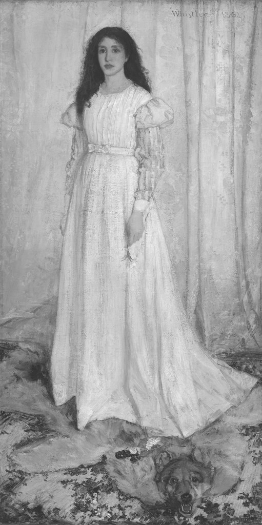
A paradigmatic example is painter James Abbott McNeill Whistler. In 1862, his work known as Woman in White (fig. 7) was rejected by the academy. One of the reasons for the scandal that followed was his disregard for perspective, which created a flat, two-dimensional scene. Critics also pointed out that it was a bad illustration of one of the most popular books of the time, Wilkie Collins’s proto-mystery novel The Woman in White (1859). Whistler responded that he was not interested in illustrating a book he had never read and that the coincidence between the titles was the gallery’s responsibility. He had simply tried to paint a girl dressed in white in front of a curtain. He named the painting Symphony in White No. 1 to underscore his formal intentions.5
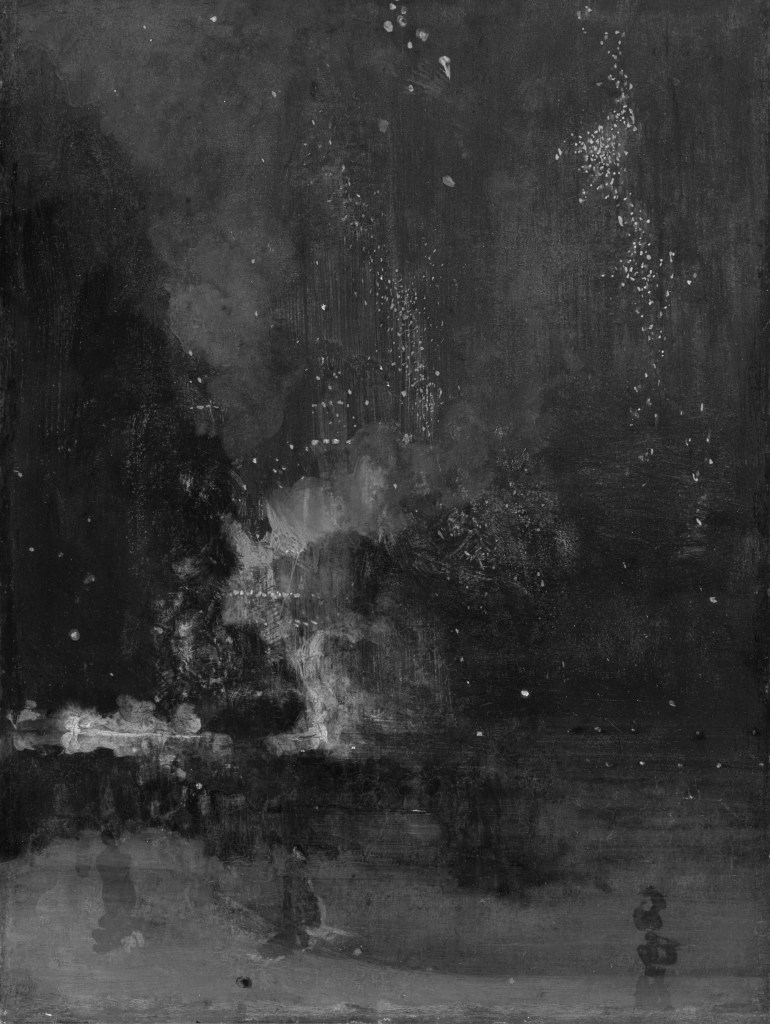
This emphasis on the two-dimensional and non-representational character of painting would only gain terrain during the second half of the 19th century. Whistler himself invested in increasingly bold attempts on abstraction. In 1877, when he presents his Nocturne in Black and Gold – The Falling Rocket (fig. 8), critic John Ruskin accuses him of “flinging a pot of paint in the public’s face”, to which the painter responded with a libel lawsuit — which he won.6 All of this would culminate in the abstract movements of the early-20th century.
It might be less mentioned, but there was a similar tendency in mid and late-19th century design, favouring non-representational, two-dimensional compositions. Histories of design commonly refer to the lack of quality perceived in English products at the time of The Great Exhibition of 1851. It is common to find this problem justified by the pretext of technical issues. One of the most likely origins of this reference is Nikolaus Pevsner’s Pioneers of Modern Design (1962), one of the first histories of design.
However, it is often omitted that this lack of quality was presented by Pevsner as an aesthetic problem: “The aesthetic quality of the products was abominable. Sensible visitors realised that, and soon discussions started in England and other countries as to the reasons for such an evident failure.”7 Commenting on some of the tapestries in display, he pointed out the causes of such failure:
Eighteenth-century ornament may have influenced the designer, the coarseness and overcrowding are his original addition. Moreover, he had neglected all fundamental requirements of decoration in general and of carpet decoration especially; we are forced to step over bulging scrolls and into large, unpleasantly realistic flowers; it seems unbelievable that the teachings of Persian carpets should have been so completely forgotten. And this barbarism was by no means limited to England. The other nations exhibiting were equally rich in atrocities. Take the design for a silk shawl by E. Hartneck, shown in the French section. This is at least as incongruous as the English carpet in its mixture of stylization and realism. It shows the same ignorance of that basic need in creating patterns, the integrity of the surface; and the same vulgarity in detail.8
Summing up, because of their design, combining flat motifs and realistic representations, these patterns were an affront to the “integrity of the surface”, which was nothing more than its flat nature. If there could be any doubts about this interpretation, Pevsner dispels them shortly after, when he lists the rules of design proposed by Henry Cole in his Journal of Design and Manufactures (1849), the first magazine dedicated to the discipline.
One of them precisely dictates that: “wallpapers and carpets must have no patterns ‘suggestive of anything but a level or plain’”. Commenting on Owen Jones’s chintz patterns, he praises a design that “is, as it ought to be, of a perfectly flat unshadowed character. Secondly, the quantities and lines are equally distributed, so as to produce at a distance the appearance of levelness.”9
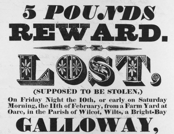
This programmatic two-dimensionality, emphasised by uniform decorative motifs, is found in the book pages designed by William Morris or Will Bradley. On the latter, the critic Adolf Loos would bestow the title of king of typographers in a text written in 1898,10 a rare praise coming from him. The honour was also a quip against the poor quality of the graphic arts of the time, which Loos attributed to the trend of representing perspective using shadowed types. He was referring to types like the one used to write the word “Lost” in the ad above (fig.9).
Loos insisted that “these are only portraits of types, not real types. Types made for paper have no other strength than that which is given to them by the printing ink.”11 He also criticised the way printers managed the “difficult issue” of combining type and image:
Imagine, for example, an Alpine landscape in the usual oil‑painting manner with the slogan “Alpine Herb Champagne is the best” printed in normal type on the blue sky or the green waters of the lake. One doesn’t even need to imagine it, one can see it often enough as it is.12
This is an obvious reference to typography inspired by the composition methods used in lithographic illustration, which often depicted type as objects in landscapes, still lifes or street scenes. (fig. 10)
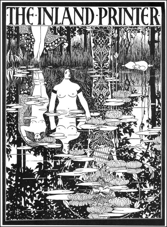
For Loos, the antidote was the work of American typographer Will Bradley (fig. 11), which offered no illusions or suggestions of perspective:
He has a very primitive eye. All he sees are two colours and their absence, which for him are like blank paper, because he has to make do with those two colours. But with these two tones he is able to create a stronger effect than our painters with their nine colour prints. His is a small world, as small as the craftsman’s. But in that world, he is king.13
Here, we are very obviously thrown back into graphic design’s obsession with two-dimensionality and limited colour palettes. What remains to be seen is how a formal option thought up in the late 1800s took root as the identity of graphic design as a discipline.
There are several, not mutually exclusive theories. The most straightforward is that design emerged as a discipline when this trend was at its peak, popularised in magazines, taught in schools and manuals. This assured its continuation in the following generations of designers, who had to deal with it as the dominant canon whether they subscribed to it or not. Nonetheless, this is an essentially institutional theory and I believe it to be possible to develop a formalist theory able to explain this phenomenon.
Two-dimensionality became dominant because the transition from premodern to modern design implied a drastic change in the way one thinks about form.14 In premodern design, form was only one step in the process through which symbols and styles from every culture and epoch were transformed into ornament. It was the conceptual mechanism used to separate these symbols from their original contents and functions, so that they could be captured and assimilated by capitalist industrial production. It was a universalizing device that levelled a plane in which were deposited vastly different objects from many diverse contexts, cultures, or times.
In modern design, form ceased to be an intermediate step and became an end in itself. Design was no longer a synthesis of heterogeneous styles and symbols and began to focus solely on the process of formal abstraction itself, which in turn became synonymous with design. From this point on, it was no longer necessary to understand how different symbols and objects relate to each other through form. Accepted as natural, universal, and timeless, that internal process of design was now the only thing of real significance. Because of this, the principles of two‑dimensionality and colour economy crystallise as a dogma that will define all concurring views as ugly, distasteful, rebellious, or experimental.
In a first moment, modern design is not energised by the symbols and objects of other cultures and times, but rather by concepts like the integrity of materials and surfaces, and composition rules utilised as visible stylistic principles: the grid, negative space, left alignment. It is a form that aspires to be a neutral emanation of what was demanded of modern design: to communicate contents while organising them in clear and direct forms.
Although it has long been accepted that design is not a neutral process, this criticism is generally focused on contents, political contexts, or economic or labour conditions. The critique remains to be done in what concerns the most intimate and untouched facets of the discipline, a criticism for which designers have no vocabulary or adequate conceptual tools. To some extent, their identity as a group depends on this ignorance.
To produce a formalist critique, this is, to address a social and political context through form rather than going the other way round, one needs to start by separating design objects from their contents. Once this is done, the relations between art and design become immediately visible, their common forms, formal strategies, and claims. The divide between these two disciplines becomes porous, opening them to new objects, new methods, and processes.
Translated by José Roseira
Previously published in Impossuível #1
Portuguese version.
Notes:
1. A Força da Forma, Orfeu Negro, 2019.
2. Anoushka Khandwala, What Does It Mean to Decolonize Design? – Dismantling design history 101, https://eyeondesign.aiga.org/what-does-it-mean-to-decolonize-design/
3. «O design que o design não vê – Raça, Género, Classe» in Mário Moura, O design que o design não vê, Orfeu Negro, 2018.
4. Yve-Alain Bois et al. Art Since 1900, Thames & Hudson, 2004, p. 34.
5. Kerr Houston, An Introduction to Art Criticism: Histories, Strategies, Voices, Pearson, 2012, p.45.
6. Philip McCouat, The Two Women In White, http://www.artinsociety.com/the-two-women-in-white.html
7. Kerr Houston, Idem, p.44.
8. Nikolaus Pevsner, Pioneers of Modern Design, p. 41.
9. Ibidem, p. 41-42.
10. Ibidem, p. 46.
11. Adolf Loos, Ornamento e Crime, Cotovia, 2004.
12. Ibidem, p. 162.
13. Ibidem, p. 163.
14. Richard Hollis describes this development in his text Ornament as Information: “ […] ornament is no longer taken seriously by designers. It is little used. Ornament has been in conflict with the practice and attitudes of designers from the beginning of the twentieth century. Form was to take the place of ornament.”in Writings About Graphic Design, Occasional Papers, 2012, p.148.
Remarks about some of the images:
○ The SIC logo on the cover and fig. 1 is the 2001 version.
○ fig. 4 is a woodcut from JG Wood’s The Natural History of Man, published in 1868. The image was engraved by the Dalziel Brothers,who also worked on John Tenniel’s illustrations for Lewis Carroll’s Alice in Wonderland. The settlement is described as a Zulu “Kraal”, a word I first assumed to be of African origin but later learned to be an Afrikaans word derived from the Portuguese “Curral” [an enclosure for animals]. This is a consequence of Portuguese colonialism.The Zulu word is isibaya, a term with a broader meaning: homestead, place for worship, etc.
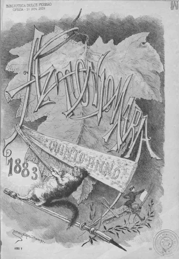
○ Fig. 10 is the cover of Rafael Bordalo Pinheiro’s António Maria satirical magazine.
